- October 8, 2020
- Posted by: teamDigital Marketing
- Category: Others
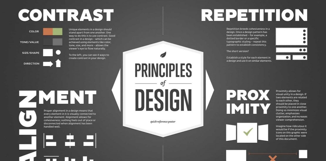
Graphic designers create, but it doesn’t necessarily mean they’re creative. The role of creativity is vital, especially for designers, whom most people consider creative simply by their work. While creativity is subject to multiple definitions, it must work in tandem with other concepts before it can be taken advantage of.
Graphic Design is the art and profession of selecting and arranging visual elements such as typography, images, symbols, and colours to convey a message to an audience. Sometimes Graphic Design is called “Visual Communications”. An important part of the designer’s task is to combine visual and verbal elements into an ordered and effective whole. Graphic Design is therefore a collaborative discipline which includes a writer to produce words and photographers and illustrators to create images that the designer incorporates into a complete visual communication. You can learn all these in a month if you click here to take a course on Graphics and Branding.
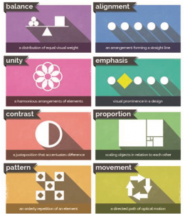
To master Graphics Design you must know the principles of design and practise daily to attain creativity. Let’s get started;
- Emphasis: When creating a design, what is the first piece of information the audience needs to know? Is it the band or photography? Or the concert venue or time? What about the day and the cost of attending? You will need to organize the information in order of importance by emphasizing them. You can do that by either making one information bigger or bolder than the others or you can use colour to differentiate your information. The most important thing is your audience should be able to read the information and be able to distinguish which information is more important.
- Alignment: Alignment is an important fundamental of design since it helps create a sharp, ordered appearance by ensuring the elements have a pleasing connection with each other. Aligning objects properly will clean up a design and eliminate the messiness or sloppiness that can occur when elements are placed randomly.
- Balance: Balance gives a design its form and stability and helps to distribute the elements evenly throughout your design, this even spacing will offer an appearance that is professional and attractive instead of being jumbled and messy.
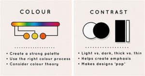
- Contrast: Contrast creates space and difference between elements in your design. Your background needs to be significantly different from the colour of your elements so they work harmoniously together and are readable.
- Repetition: If you limit yourself to two strong typefaces or three strong colours, you’ll soon find you’ll have to repeat some things. That’s ok! It’s often said that repetition unifies and strengthens a design. Repetition is vital for Brand identity.
- Proportion: Proportion is the visual size and weight of elements in a composition and how they relate to each other. It often helps to approach your design in sections, instead of as a whole.
- White Space: White space also referred to as “negative space”, it is the areas of a design that do not include any design elements more like empty. Many designers overlook the value of white space. But white space serves many important purposes in a design, foremost being giving elements of the design room to breathe. Negative space can also help highlight specific content or specific parts of a design.
Movement: Movement refers to the way the eye travels over a design. The most important element should lead to the next most important and so on. This is done through positioning (the eye naturally falls on certain areas of a design first), this can be achieved through emphasis, and other design elements already mentioned.
A design doesn’t have to strictly follow these rules to be “good.” Some mind-blowing designs ignore one or more of the principles of design in order to create an eye-catching and effective work.
However, it’s typically done by “designer’s intuition” and may take a lot of trial and error to create something that looks good and creates an optimal user experience.
Graphic design is a field, where things change very fast both creatively and technically. Though it is relatively easy to learn technical skills, it is also very important to concentrate on expanding and improving your creativity. If you want to become a successful graphic designer, you should master the principles of design.


