- September 7, 2023
- Posted by: team SOUTECH
- Category: Blog, Data Analysis and Virtualization, Data Science Free Training, Free 7 Days Course

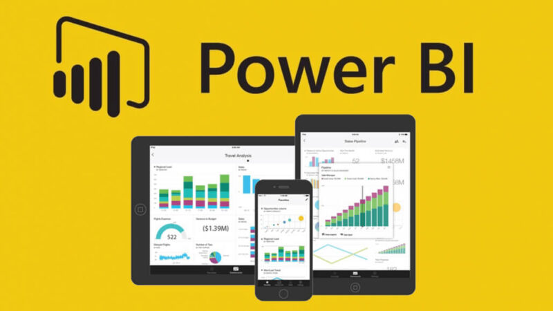
Data visualization is an art that transforms raw data into meaningful insights. The PowerBI PL300 Certification places a significant focus on advanced data visualization techniques. In this article, we delve into the world of advanced data visualization with PowerBI.
The Power of Data Visualization: Data visualization is the process of representing data graphically to aid in understanding and decision-making. Effective data visualization can reveal patterns, trends, and outliers.
Advanced Visualizations: PL300 candidates will explore a wide range of advanced visualizations in PowerBI, including custom visuals, custom themes, and the use of APIs to create unique data visualizations.
Custom Themes and Branding: Creating custom themes allows you to align your visualizations with your brand’s identity. PL300 covers how to design and apply custom themes to reports and dashboards.
Interactivity: Advanced data visualization often includes interactive elements. Candidates will learn how to create interactive reports and dashboards that allow users to explore data on their own.
Cross-filtering and Highlighting: PL300 explores advanced techniques for cross-filtering and highlighting, which enable users to interact with one visualization to dynamically update others.
Advanced Analytics Visualizations: Candidates will dive into advanced analytics visualizations, including forecasting, clustering, and custom R visuals.
Accessibility: Ensuring that data visualizations are accessible to all users, including those with disabilities, is vital. PL300 covers accessibility best practices for data visualization.
Real-world Projects: The certification includes real-world projects that challenge candidates to apply their advanced data visualization skills to practical scenarios.
Best Practices: Following data visualization best practices, such as choosing the right chart types, using color effectively, and providing clear labels, is crucial for creating informative and visually appealing visualizations.
Continuous Learning: Data visualization is an evolving field. To stay current, candidates should explore the latest trends and best practices in data visualization through books, courses, and communities.
Conclusion: Advanced data visualization is a key component of the PowerBI PL300 Certification. By mastering advanced visualization techniques, professionals can create compelling and insightful reports and dashboards that drive data-driven decision-making.
Feel free to use and modify these articles as needed for your course. If you have any more requests or require further assistance, please don’t hesitate to ask!


